Before
Viewport media queries can make every card change at the same browser width, even when one card sits in a narrow sidebar and another sits in a wider content lane. That makes modular widgets brittle.
Design Technologist · AI-Assisted CSS Engineering
This showcase documents the complete assignment from raw semantic HTML through prompt
engineering, human auditing, and a verified Adaptive Product Feature Card that uses
@container and :has() instead of JavaScript-driven layout or theme state.
The same product card must stack in a compact slot and stretch into a row when its own container permits it.
Viewport media queries can make every card change at the same browser width, even when one card sits in a narrow sidebar and another sits in a wider content lane. That makes modular widgets brittle.
Each .card-container becomes an inline-size query container. The card checks its own
checkbox state with :has(), so the dark palette belongs only to the card that was toggled.
Six coordinated ideas let one repeated card structure respond to local space and local state.
The card wrapper becomes the measurement source, allowing identical widgets to behave differently in different slots.
The layout changes only when the individual card container crosses the assignment's 480px inline-size threshold.
The card can restyle itself when its descendant checkbox is checked without adding helper classes or scripts.
The native checkbox state supplies the interactive signal that turns one card into its dark theme.
Scoped custom properties make palette swaps local to the toggled component rather than global to the page.
The card begins as a column and turns into a row only inside a container query that proves enough space exists.
The assignment starts with one identical product card repeated in a narrow sidebar and a wider main container.
<!DOCTYPE html>
<html lang="en">
<head>
  <meta charset="UTF-8">
  <meta name="viewport" content="width=device-width, initial-scale=1.0">
  <title>Week 06 Lab: Adaptive Card Widget</title>
</head>
<body>

  <div class="workspace-grid">
    <!-- NARROW CONTAINER (Sidebar) -->
    <aside class="sidebar-wrapper">
      <div class="card-container">

        <article class="adaptive-card">
          <div class="adaptive-card__image-box">
            <img src="https://images.unsplash.com/photo-1542291026-7eec264c27ff?w=400" alt="Product Image" class="product-img">
          </div>
          <div class="adaptive-card__content">
            <h3 class="product-title">Retro Sneakers</h3>
            <p class="product-description">Premium classic athletic footwear engineered with modern perceptual cushioning.</p>
            <div class="adaptive-card__controls">
              <label class="toggle-control">
                <input type="checkbox" class="theme-checkbox">
                <span class="toggle-slider"></span>
                <span class="toggle-label">Dark Theme</span>
              </label>
            </div>
          </div>
        </article>

      </div>
    </aside>

    <!-- WIDE CONTAINER (Main Content) -->
    <main class="main-wrapper">
      <div class="card-container">

        <article class="adaptive-card">
          <div class="adaptive-card__image-box">
            <img src="https://images.unsplash.com/photo-1542291026-7eec264c27ff?w=400" alt="Product Image" class="product-img">
          </div>
          <div class="adaptive-card__content">
            <h3 class="product-title">Retro Sneakers</h3>
            <p class="product-description">Premium classic athletic footwear engineered with modern perceptual cushioning.</p>
            <div class="adaptive-card__controls">
              <label class="toggle-control">
                <input type="checkbox" class="theme-checkbox">
                <span class="toggle-slider"></span>
                <span class="toggle-label">Dark Theme</span>
              </label>
            </div>
          </div>
        </article>

      </div>
    </main>
  </div>

</body>
</html>
Browser defaults only
Retro Sneakers
Product Image
Premium classic athletic footwear engineered with modern perceptual cushioning.
The prompt turns the assignment blueprint into a strict CSS contract that forbids viewport-driven component sizing.
Lock the supplied class names so the final CSS remains auditable against the assignment HTML.
Make each card wrapper the inline-size measurement context with container-type.
Start with a stacked product card that works in the narrow sidebar before any query is met.
Use @container (min-width: 480px) to switch the card into a horizontal layout.
Use the checked child input to swap only the parent card's local theme variables.
Forbid JavaScript, helper classes, and viewport media queries for the component behavior.
Act as a senior CSS systems engineer. Generate a production-ready stylesheet for the supplied Adaptive Product Feature Card HTML without replacing its structural class system.

Implementation requirements:

1. Preserve the supplied workspace, wrapper, container, card, image, content, control, checkbox, slider, and label class names exactly so the CSS can be audited against the original HTML.

2. Register every `.card-container` as an inline-size query container with `container-type: inline-size;` so each card responds to its own available space rather than the viewport.

3. Create a default stacked `.adaptive-card` layout that works inside the narrow sidebar container, keeps the product image above the text, and avoids fixed heights or overflow-prone widths.

4. Add `@container (min-width: 480px)` rules that convert the card into a horizontal row with a clean 50/50 image-to-content distribution only when the individual card container is wide enough.

5. Use `.adaptive-card:has(.theme-checkbox:checked)` to swap local CSS custom properties for the checked card only, producing a scoped dark-theme palette without JavaScript or helper classes.

6. Style the checkbox toggle accessibly so the input remains keyboard focusable, the slider visually reflects the checked state, and the label stays readable in both card palettes.

7. Do not use viewport-based `@media` queries for the component sizing behavior, and do not add JavaScript, layout-state classes, frameworks, or generated markup.

8. Include concise comments that distinguish the container-query behavior from the state-aware `:has()` theme behavior.

Return only the complete CSS stylesheet.The final code is accepted only when the selector scope, container behavior, and no-JavaScript boundary are visible in the CSS.
.card-container owns container-type: inline-size.@container (min-width: 480px), not a viewport query..adaptive-card:has(.theme-checkbox:checked)..card-container {
container-type: inline-size;
}
.adaptive-card {
--card-bg: var(--adaptive-demo-card);
--card-text: var(--adaptive-demo-card-text);
display: flex;
flex-direction: column;
}
.adaptive-card:has(.theme-checkbox:checked) {
--card-bg: var(--adaptive-demo-card-dark);
--card-text: var(--adaptive-demo-card-dark-text);
}
@container (min-width: 480px) {
.adaptive-card {
flex-direction: row;
align-items: stretch;
}
.adaptive-card__image-box,
.adaptive-card__content {
flex: 1 1 50%;
}
}The sidebar card remains stacked while the wider card turns into a row, and each toggle controls only its own card.
Wide main container
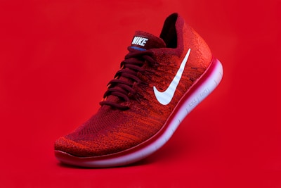
Premium classic athletic footwear engineered with modern perceptual cushioning.
The narrow card keeps its column layout because its own container never reaches the query threshold.
Each checkbox is read by its nearest parent card selector, so the other card remains unchanged.
The adaptive behavior follows component space instead of global browser width.
The widget is accepted only when the layout, state, scope, and accessibility checks all hold.
.card-container and confirm its computed container-type is inline-size.@media query controls the card sizing behavior..adaptive-card:has(.theme-checkbox:checked).AI drafted the CSS. Human auditing verified the container-query boundary, the :has() selector scope, and the no-JavaScript assignment rule.